In the world of digital marketing, it is essential to be able to clearly visualise the results obtained.
It's not enough to simply gather the data linked to your objectives or KPIs, you must also organise them clearly, so you can draw the right conclusions. This begs the question: what's the best way to organise and present your results?
It is for this reason that Google has rolled out several tools aimed at web marketers, since 2016. One of these tools is the invaluable: Google Data Studio.
It enables you to generate attractive, customisable reports to make your data easier to read.
Here at Arcane, we are well aware of these reports and use them every day to track our KPIs, but also to produce reports aimed at our clients. In this article, you'll find out why and how to use the features of Google Data Studio.
What is Google Data Studio?
An essential reporting tool
It's a free tool that allows you to generate reports and dashboards from your data. To do that, Data Studio offers native connectors to the main platforms which collect data from your different accounts and display them in a single report.
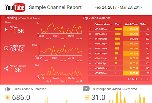
The tool is presented in the form of a blank page to which you can add a certain number of graphics The range of visualisations on offer is very wide, from a simple table to geographical maps, and is still very easy to use. If needed, there are also report templates for super simple visualisations as shown below:

Why use it?
Data Studio reports represent a considerable saving in time because they simplify the way a report is designed and produce a high-quality result.
The platform allows you to:
- Create collaborative and shareable reports, such as Google Drive documents
- Produce clear attractive reports
- No more need to import and export data, plus you get access to automated reports
- Filter the reports by “date” or any other criterion to dynamically display the corresponding data
- Consolidate data sources
- Compare your data to other periods
How to create and use Google Data Studio?
Focus on data sources
Google explains very clearly how Data Studio accesses your data. The Mountain View company also states that these sources are key for several reasons:
- They provide a system of access control to data
- They enable you to model your data, by personalising the fields contained in your data source so that your reports display your data the way you want it to be
- They provide a consistent definition of the statistics shared within your company
- They are useful for defining other options, such as the freshness of the data, by using a cache
Google uses connectors to gather data. Some are free and offered by the company, particularly in relation to Google Marketing Platform products. Other connectors are created by Data Studio partners, for which a fee is sometimes charged.
To get started, just select the connectors that interest you.

Creating a Google Data Studio report
Use of the tool is fairly intuitive, here are a few details to help you create your first report!
- Sign in to Data Studio with your Google account. Once you're signed in, the menu on the left gives you access to all the applications that you can connect to create reports.
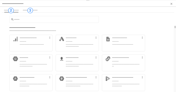
- Go to the “Data Sources” tab and click on “+” to add a new one. For example, if you want to add YouTube Analytics, just search for it in the search box, click and then choose the account that you want to link.
- To produce a new report, start again and go to the top banner. Click on the blank page. A new page opens with all the tools you need to create a new report.
- To add a visual, select “Add a visual” and choose the most suitable type. The "Data" block allows you to choose the data that you want to see displayed. “Dimension” allows you to set time-related parameters etc.
- Then, all you have to do is personalise the look of your report!
Using Google Data Studio
The Google tool is easy to use. It's a good idea to investigate the various templates that are already available. This will give you a better idea of what Data Studio can do for you.
In addition, it's always wise get several opinions about a report, so share it with your staff to get a different point of view.
Lastly, the interface seems to be an essential solution to enable you to visualise and share your data with ease.


